Building Energy Consumption Prediction
A comparison of five machine learning algorithms
Bin Yan, Constant Wette and Wen Xie
Dec 18, 2014
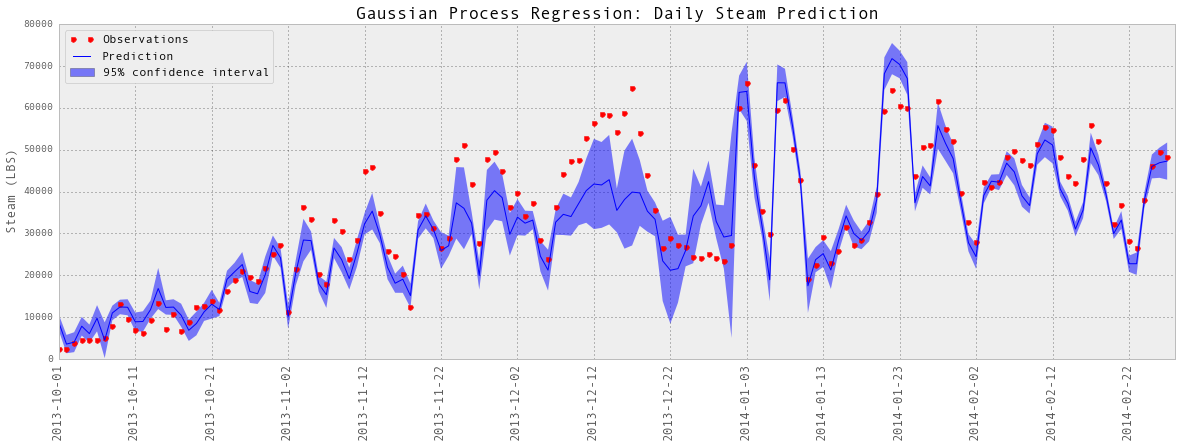
Buildings consume about 40% of the total energy use in the United States. In this project, we apply five machine learning models (Gaussian process regression, linear regression, K-Nearest Neighbour, Random Forests and Support Vector regression) to predict energy consumption of a campus building.
Machine learning models produce accurate energy consumption forecasts and they can be used by facilities managers, utility companies and building commissioning projects to implement energy-saving policies. For university facilities, if they can predict the energy use of all campus buildings, they can make plans in advance to optimize the operations of chillers, boilers and energy storage systems.
Request data for your own research.
More details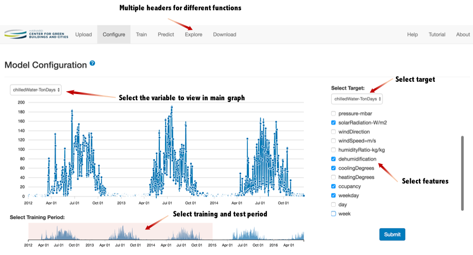
Bin Yan and Wenbo Shi
Jan 31, 2017
As Harvard CGBC researchers, we launched a new web app that uses statistical modeling and historical data to help predict building energy consumption. The Gaussian Processes Forecasting Tool allows users to upload data, configure features, train/validate a model and make predictions. Users do not need to have any machine learning background.
Read tutorial | Explore demo | Watch video
Go to the toolData Visualization Projects
Some Madness in Sankey...
Bin Yan
July 1, 2017
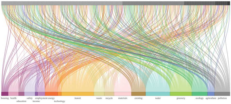
I created this vertical sankey diagram for Elena Vanz's research on urban sustainability rating systems to explore the relationship between indicators and the themes they express.
More details can be found in the paper "A multiscalar and multi-thematic comparative content analysis of existing urban sustainability rating systems".
Time-series chart with confidence range
Bin Yan
July 7, 2017
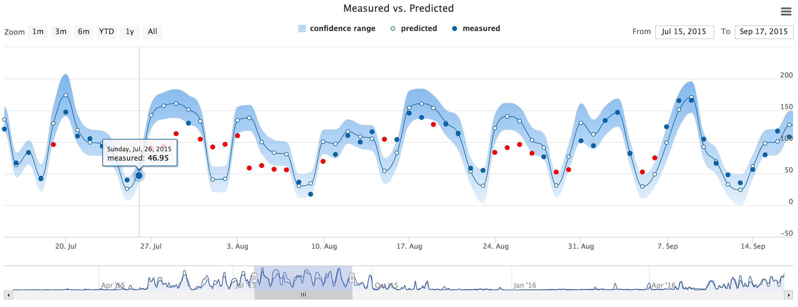
I designed this time-series chart to present gaussian process prediction results. The code is written on top of highcharts.js.
The blue line with small white circles shows the predictive mean values. The semi-transparent blue area shows the 95% confidence range. The blue dots show the measured values. If the measured value falls out of the predictive range, the dot will turn red.
Campus Energy Visualization
Bin Yan, Bing Wang and Benjamin Norman
May 12, 2015
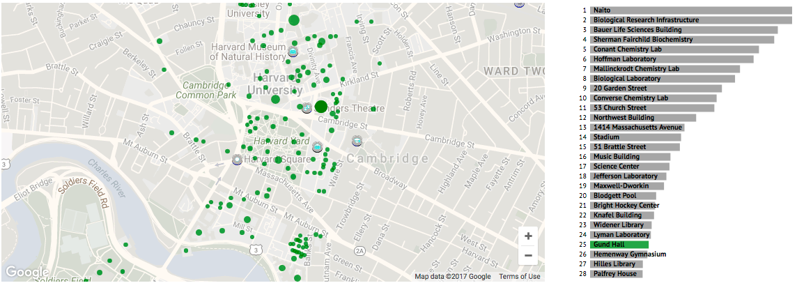
A visualization that displays the energy consumption of 151 buildings at Harvard written in D3.js. The visualization features interactive google map, bar charts and linear regression analysis of monthly building energy consumption.